
“…the U.S. is no longer the world’s top country for refugee admissions… The decline in U.S. refugee admissions comes at a time when the number of refugees worldwide has reached the highest levels since World War II.”
– Jens Manuel Rogstad, “Key facts about refugees to the U.S.”, Pew Research Center
When I read these words while researching for my infographic, I shook my head in disbelief. There are more people that need help, but the U.S. government is reducing any effort to help them.
Thus, I decided I needed to highlight this tragic disparity: though more refugees need to be resettled, the U.S. is turning them away. It’s unacceptable.
I also wanted my infographic to call my audience to action (demanding change from their state representative). As a result, I created this infographic on Canva:
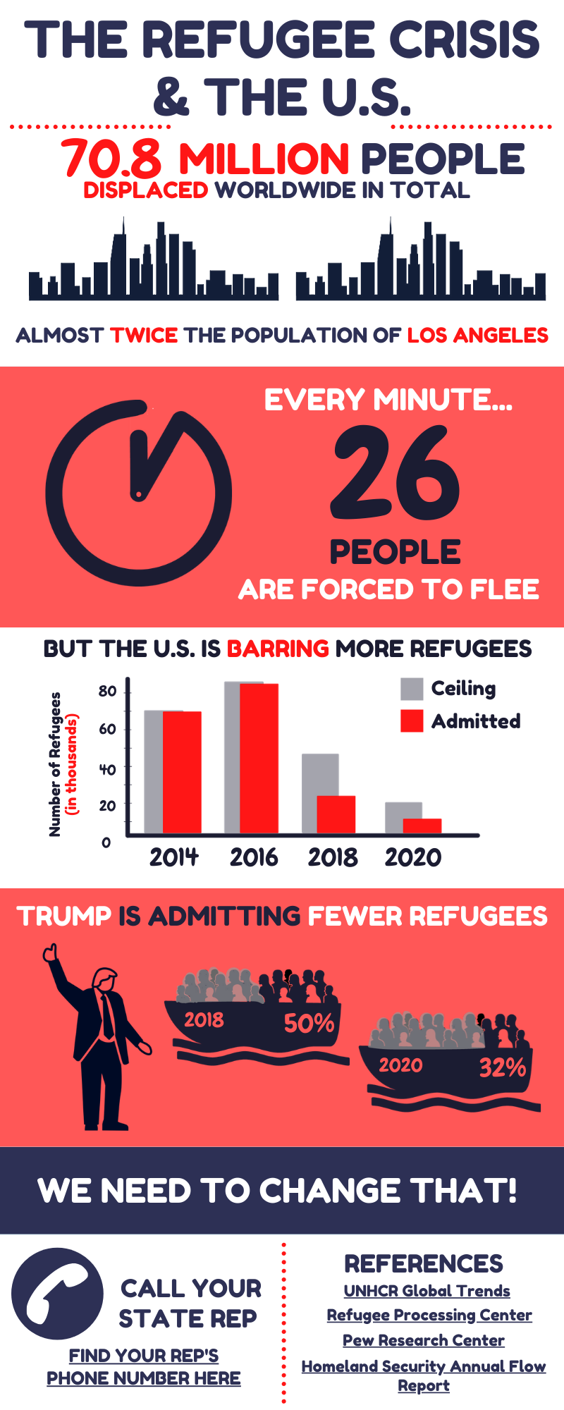
To highlight this disparity, I illustrated and visualized six data points:
- 70.8 million people in total (as of 2018) displaced worldwide (UNHCR)
- 26 people (as of 2018) forced to flee every minute (UNHCR)
- 2014: Ceiling – 70,000 refugees vs. Admitted – 69,987 refugees (Pew Research Center, Refugee Processing Center)
- 2016: Ceiling – 85,000 refugees vs. Admitted – 84,994 refugees (Pew Research Center, Refugee Processing Center, Homeland Security)
- 2018: Ceiling – 45,000 refugees vs. Admitted – 22,491 refugees (Pew Research Center, Refugee Processing Center)
- 2020: Proposed ceiling – 18,000 refugees vs. Admitted – 6,273 refugees (as of Feb. 29, 2020) (Refugee Processing Center)
The first two show how the refugee crisis is worsening. There are many people displaced worldwide, and this number may be increasing every minute.
Because there are so many displaced people worldwide, I knew I had to represent this number more accessibly. Since this infographic may be seen by my fellow students at USC, I decided to compare this number to Los Angeles. As USC students, we can recognize the vastness of Downtown LA’s population, so comparing that vastness to the insurmountable number of displacements worldwide is more feasible.

The original second data point was also huge: 37,000 people every day. For a more accessible number, I divided 37,000 by 1,440 (24 hours multiplied by 60 minutes) to get the rate per minute. This smaller-scale rate demonstrates that the refugee crisis is (literally) getting worse by the minute.
The last four points represent the disparity in huge numbers. But even though I wanted to show the widening gap between the refugee ceilings and admissions, I also wanted to demonstrate that refugees are more than just numbers. They are humans who need our help.
So, after creating the bar graph in Adobe Illustrator to visually demonstrate the widening admissions gap at a glance, I used icons to represent the human side of this issue. By graying out a large percentage of the people, I showed that some of the refugees in each boat will be turned away.
This drives my argument home: we should care about the refugee crisis because the lives of real flesh-and-blood people are at stake.

I wanted to highlight how this is a national issue, so my color scheme is red, white, and blue. We could’ve been refugees, but we aren’t. Because we are privileged, we have a duty to demand change to help resettle refugees in this country.
Sources Used
UNHCR: The UN Refugee Agency | USA – Global Trends: Forced Displacement in 2018
Homeland Security – Annual Flow Report Refugees and Asylees: 2017
Refugee Processing Center – Admissions & Arrivals – Refugee Admissions Report February 29, 2020
Pew Research Center – “Key facts about refugees to the U.S.” by Jens Manuel Rogstad


